Brand Identity, Packaging, Apparel Design, Store design
Blending street bites with spice
Koco Treat
Brand Identity, Packaging, Apparel Design, Store design
Blending street bites with spice
At its heart, Koco Treat is about reimagining tradition for fast lives. We take flavors rooted in coconut-scented kitchens and remix them for a world of city lights, queues, and cross-cultural cravings. It’s where dosa wraps sit beside smashed burgers, and coconut chutney clicks with chipotle mayo. A place where South India doesn’t stay still—it moves, adapts, and surprises.
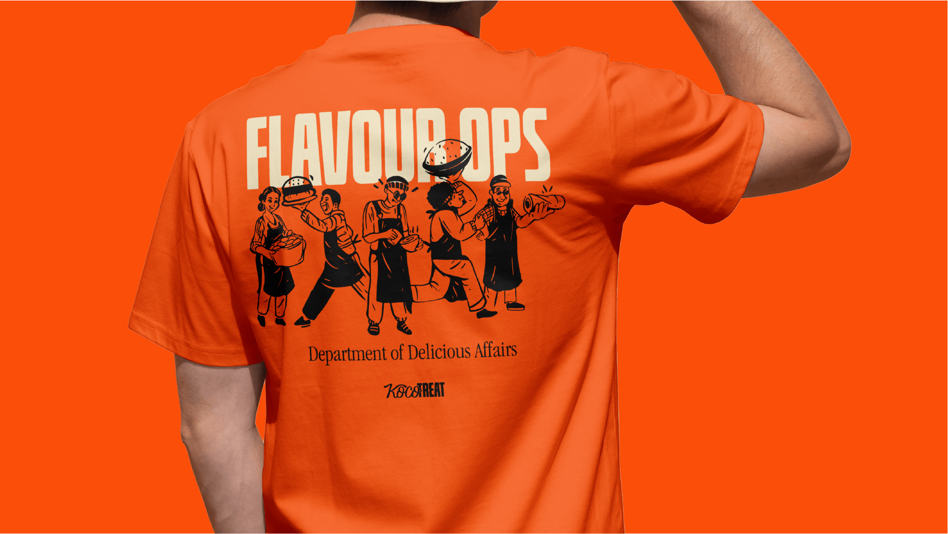
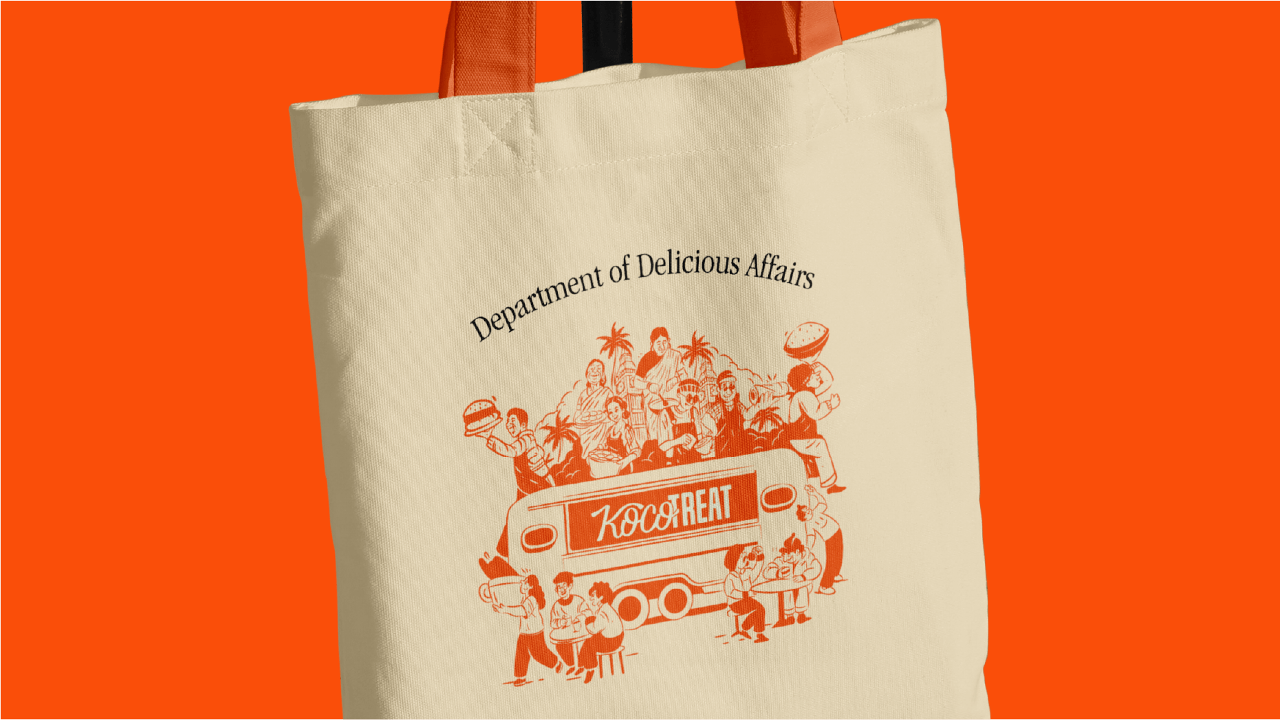
Every brand needs a character—and Koco Treat has one at its core. Koco is that friend who always says, “Come, let’s eat.” Friendly, inviting, and a little cheeky, the character becomes a guide through the brand’s world. From menu boards to stickers, Koco adds personality, creating a sense of connection that feels as real as the food itself.
At its heart, Koco Treat is about reimagining tradition for fast lives. We take flavors rooted in coconut-scented kitchens and remix them for a world of city lights, queues, and cross-cultural cravings. It’s where dosa wraps sit beside smashed burgers, and coconut chutney clicks with chipotle mayo. A place where South India doesn’t stay still—it moves, adapts, and surprises.
Every brand needs a character—and Koco Treat has one at its core. Koco is that friend who always says, “Come, let’s eat.” Friendly, inviting, and a little cheeky, the character becomes a guide through the brand’s world. From menu boards to stickers, Koco adds personality, creating a sense of connection that feels as real as the food itself.
Koco Treat’s identity is bold, playful, and unapologetically street. Inspired by the clash of coconut groves and neon signs, the visuals capture the fusion of South Indian warmth and urban energy. The logotype is simple yet confident, allowing the brand’s colors and food to take center stage.
Koco Treat’s identity is bold, playful, and unapologetically street. Inspired by the clash of coconut groves and neon signs, the visuals capture the fusion of South Indian warmth and urban energy. The logotype is simple yet confident, allowing the brand’s colors and food to take center stage.
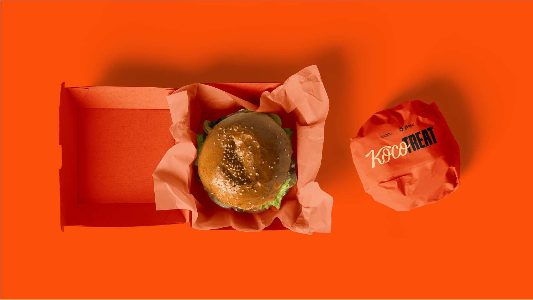
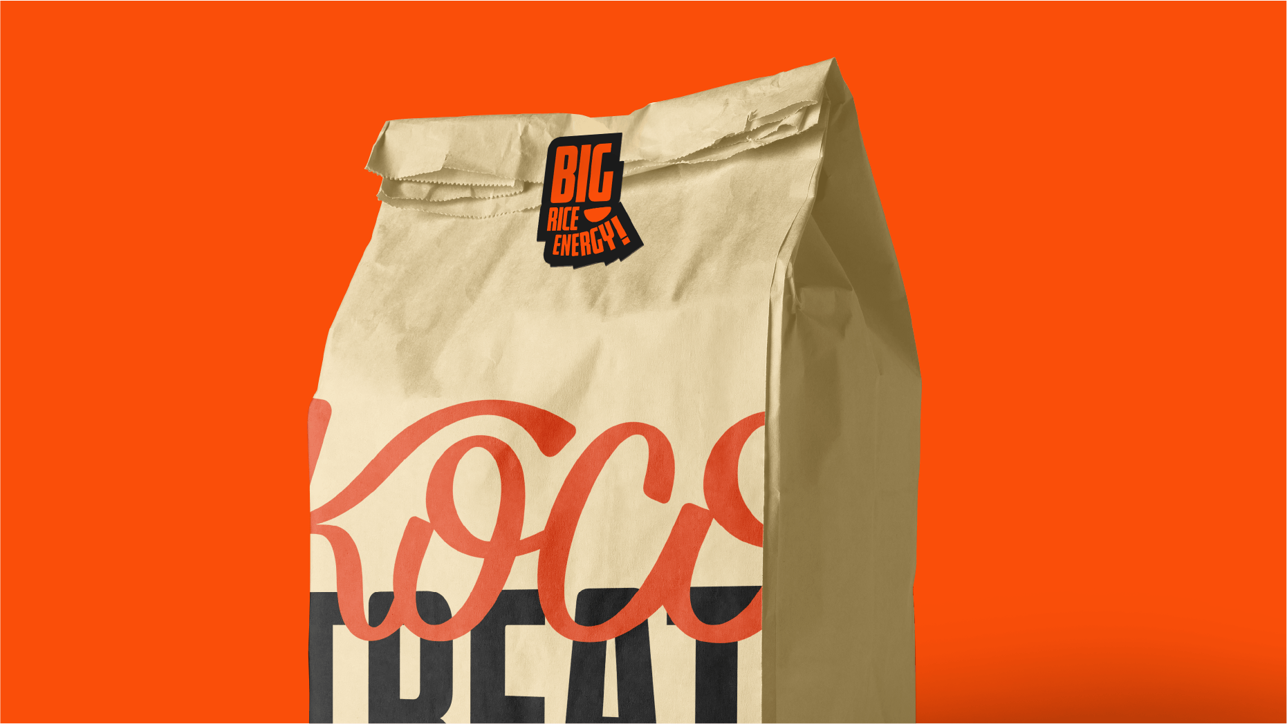
Packaging for Koco Treat was designed as an experience in itself. Bold colors, graphic play, and layered textures echo the spirit of street food stalls, while modern finishes make it unmistakably contemporary. Each box and wrap doesn’t just hold food—it tells a story of flavor collisions and cultural mashups.
Packaging for Koco Treat was designed as an experience in itself. Bold colors, graphic play, and layered textures echo the spirit of street food stalls, while modern finishes make it unmistakably contemporary. Each box and wrap doesn’t just hold food—it tells a story of flavor collisions and cultural mashups.