The everywhere store.
24 store
Year
2020
Client
24 Store
Type of client
Retail
Type of Work
Brand Identity
Increased store walk-in and sales through a strategic rebranding of a 24 hours supermarket chain based in South India.
Catering to all, 24 Store offered a democratic selection of products that range from locally grown vegetables to selected spices imported from international markets. A decade-old brand experience was declining because of market competition and Pixpil was invited to jump in to offer a solution.

The brief was to create a rebrand that was conceivable to 24 Store’s beloved customers, but also radical enough to appeal to new consumer groups. Specifically, it had to attract homemakers looking for selected and fresh produce, who had previously opted for local stores and new market players. We were challenged to create a new brand strategy and visual identity that was worthy of the 24 Store group’s ambition to put pride back into the sector.

Pixpil identified a personality for the brand after working along with the visionary founder of 24 stores. We re-positioned the supermarket concept of 24store to much lesser sqft superstores as location landmarks around the city with a centralised warehouse operation. This is based on the original attitudinal facets: freshly sourced produce being available all time everywhere. The rebrand was an immediate success and after its launch in December 2020, sales increased by 30%.
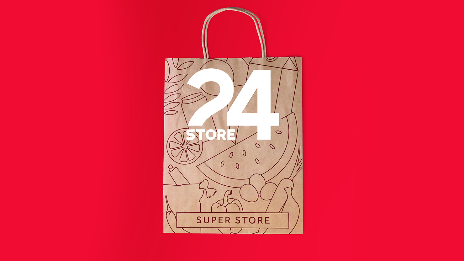
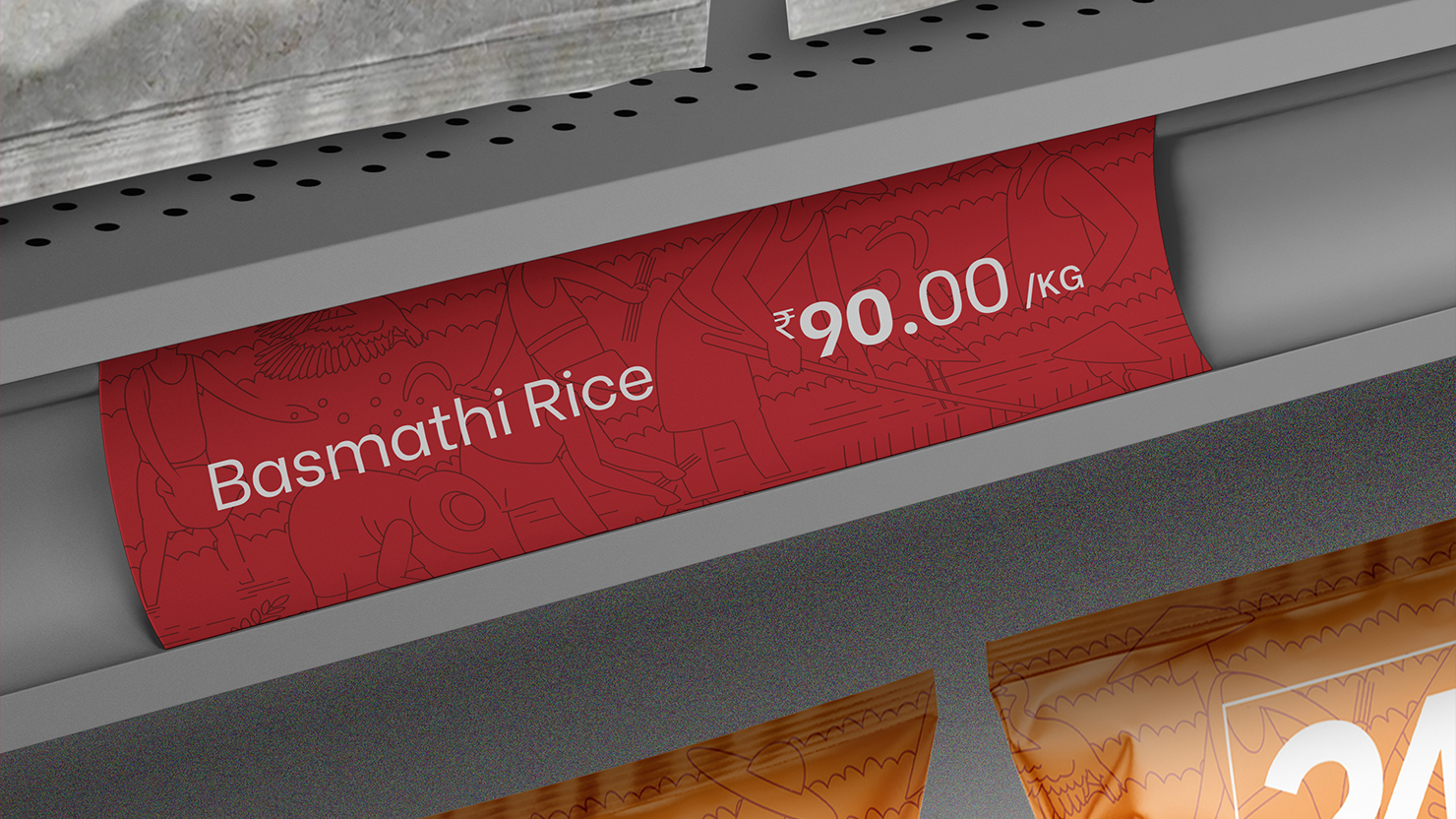
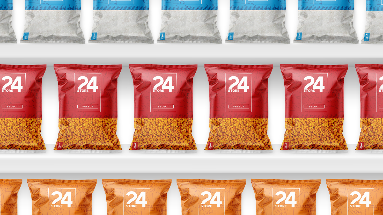
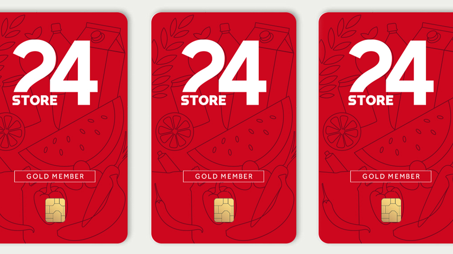
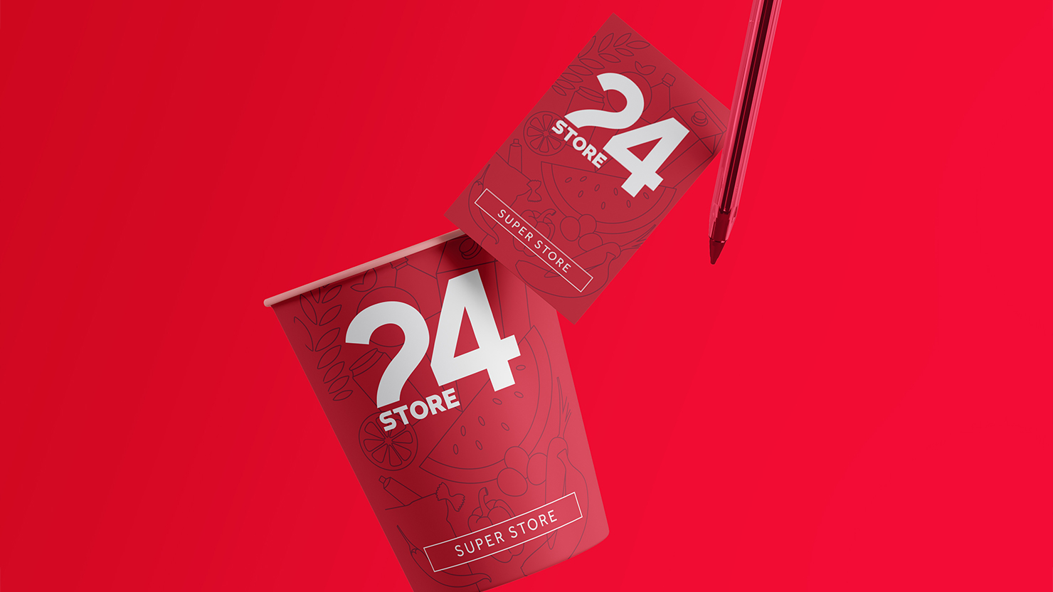
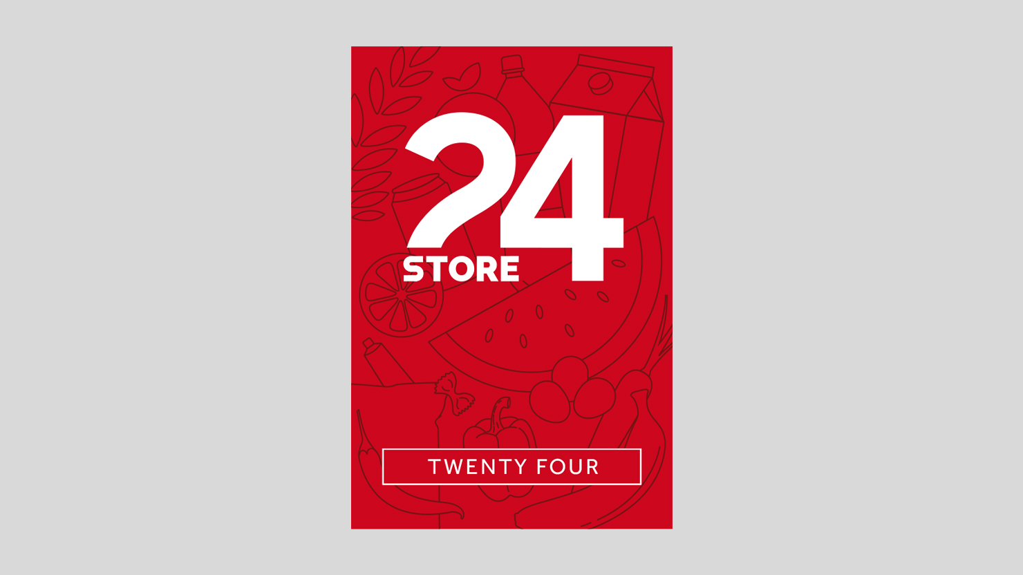
The primary brand colour is red. Pixpil brought in an expert art illustrator to create a unique brand pattern for 24 stores for their product line packages and graphics. The pattern is integrated throughout the interiors in environmental graphics that help make the space inviting and one-of-a-kind.