Health through Ayurveda since 1940
Ayur Chempankulam
Year
2020
Client
Ayur Chempankulam
Sector
Healthcare
Type of Work
Brand Identity, Digital Design, Naming, Packaging
Designed an authentic and distinctive visual identity to stand apart from other solutions on the store shelves across the Ayurvedic line of personal care products.
Before design comes to research, we made three things crystal clear. First off, the Chempankulam Ayurveda brand needed a renovation, including the brand name for digital transformation Then, a new design for their touchpoints was needed. Finally, communication with consistency, across the entire brand.


The new identity deftly shifts the focus to incorporate the company’s commitment to personal health care and its pharmaceutical and product divisions.
Designers and strategists developed the brand identity framework for the line, including brand re-positioning from a traditional ayurvedic treatment care business to a premium personal care brand,re-naming Chempankulam Ayurveda to Ayur Chempankulam for product segments and modern and simple brand pattern for packaging design which will be used across all the product branding.
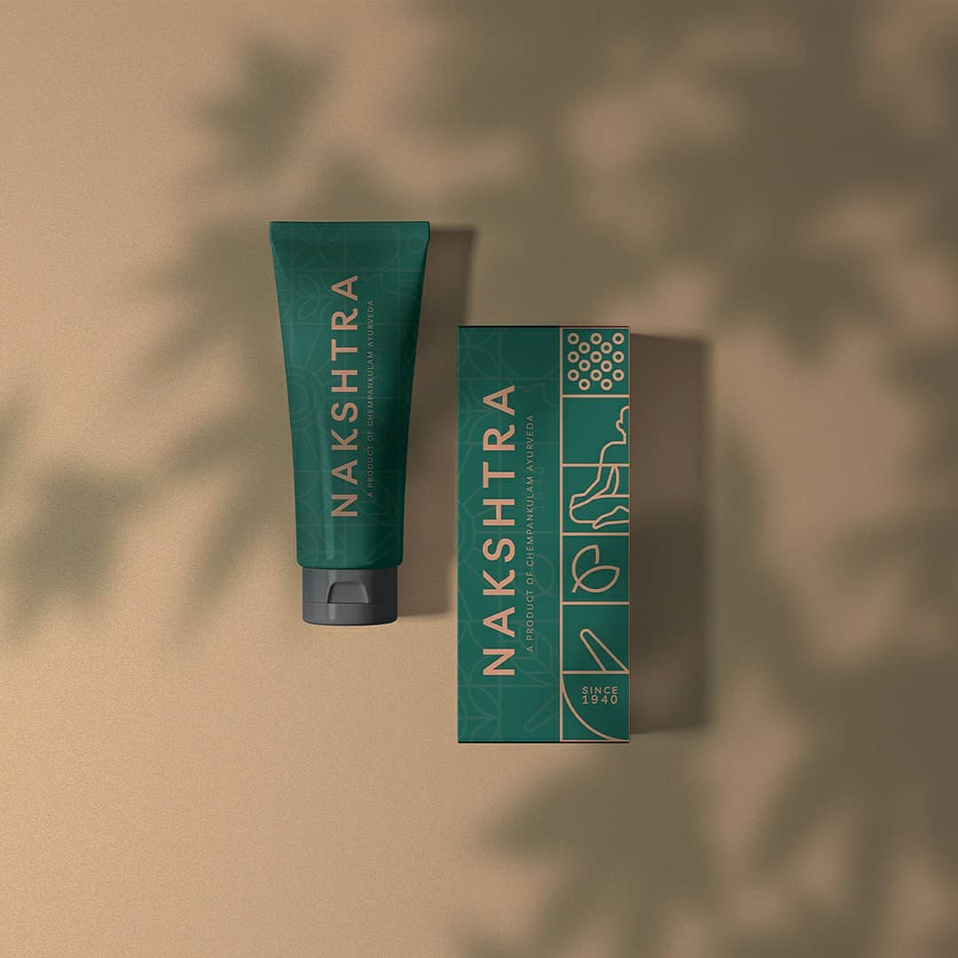
To position the brand across the digital platforms, packaging copy appears in both English and Malayalam, in line with the brand’s Kerala origins.
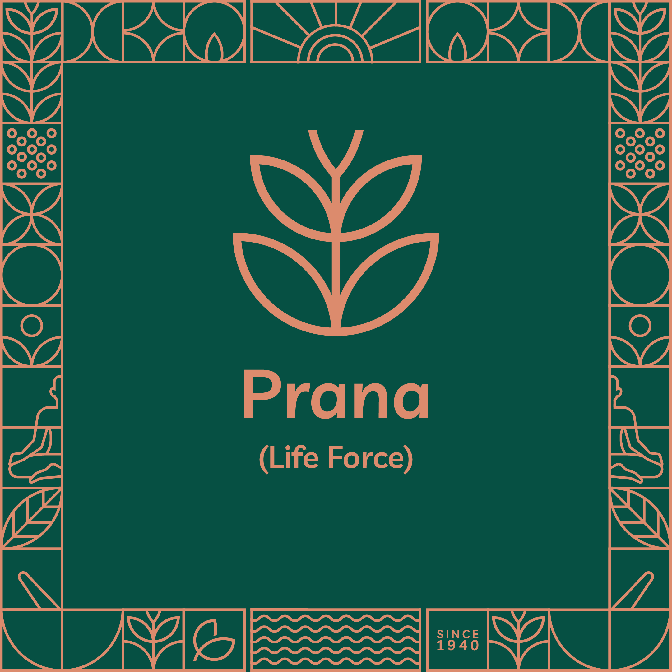
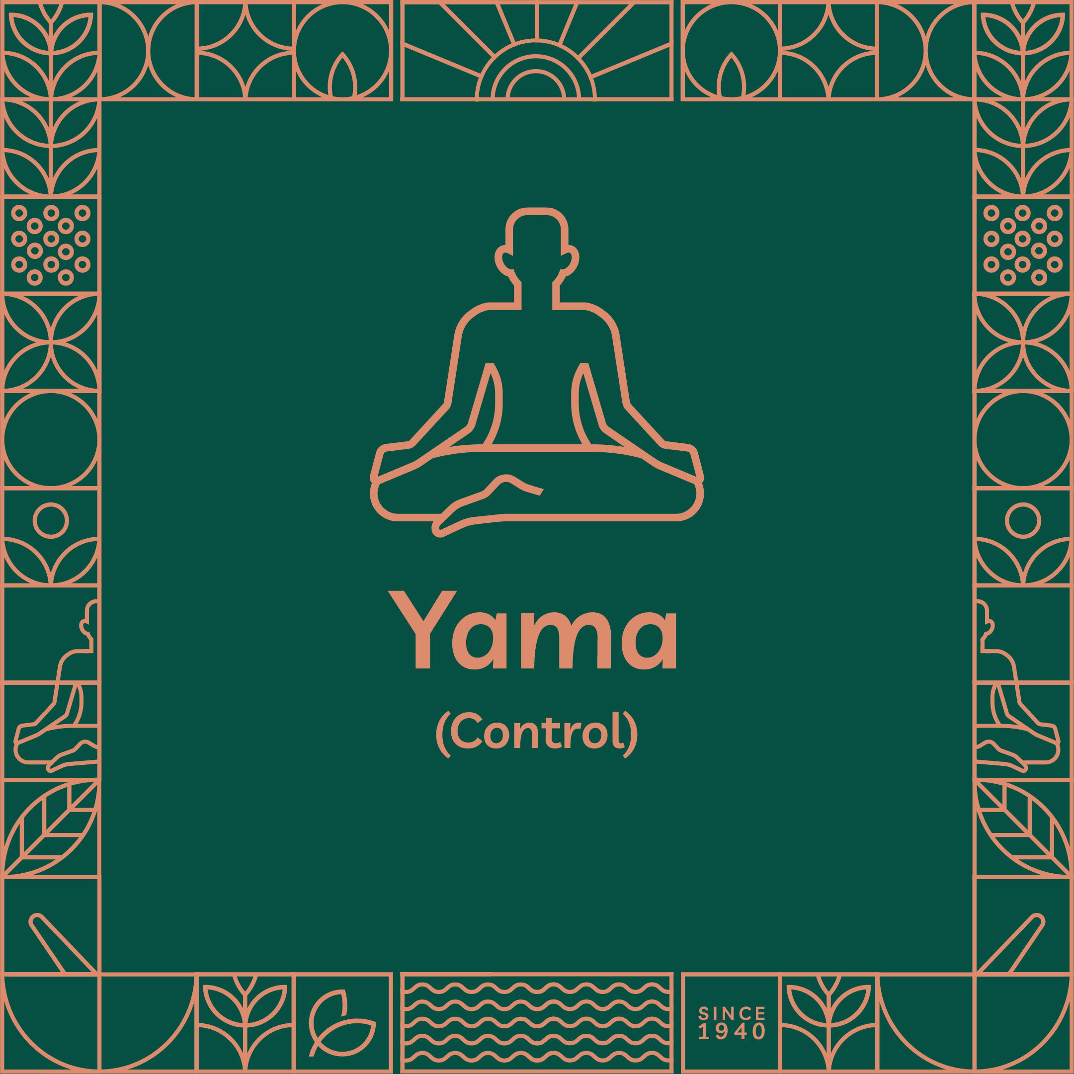
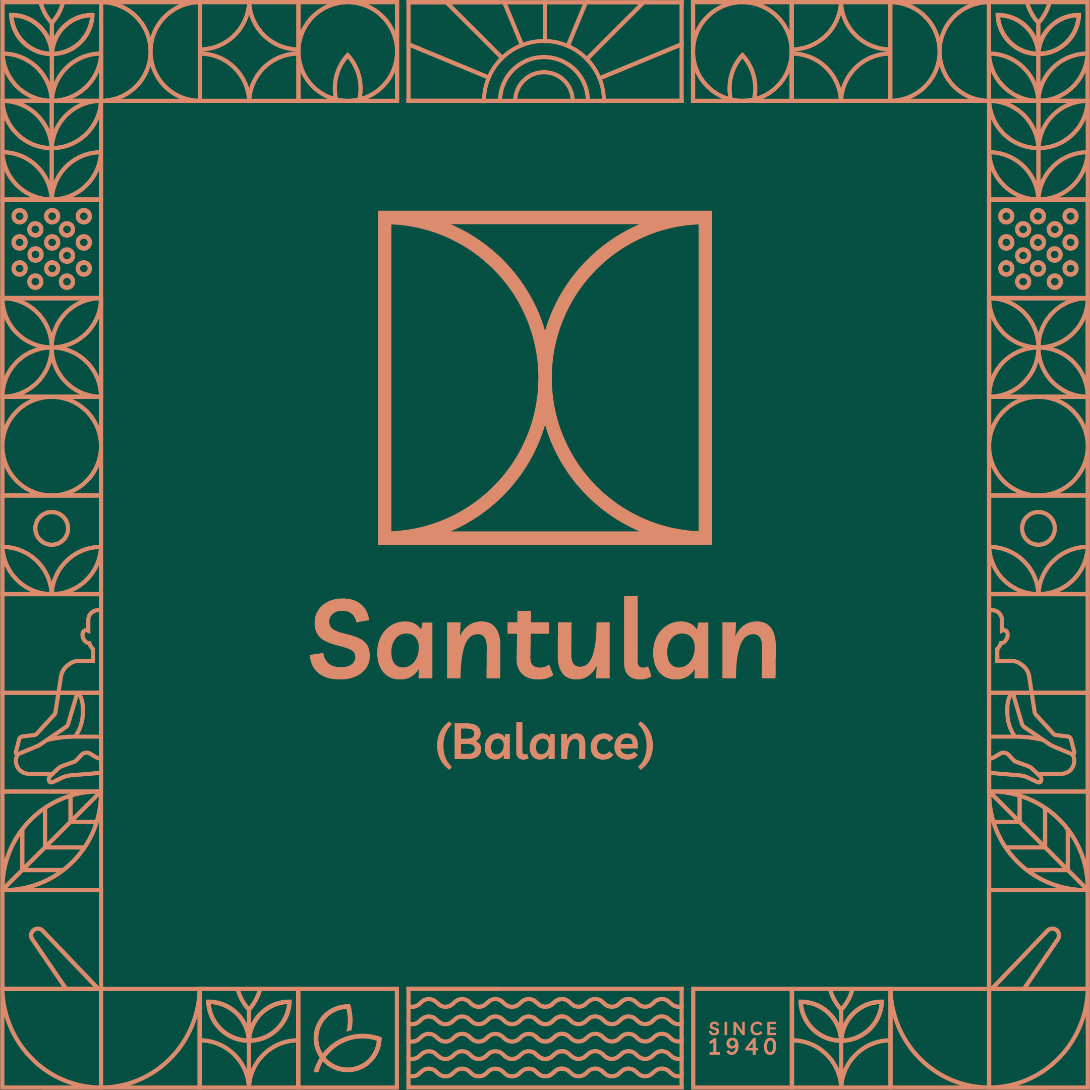
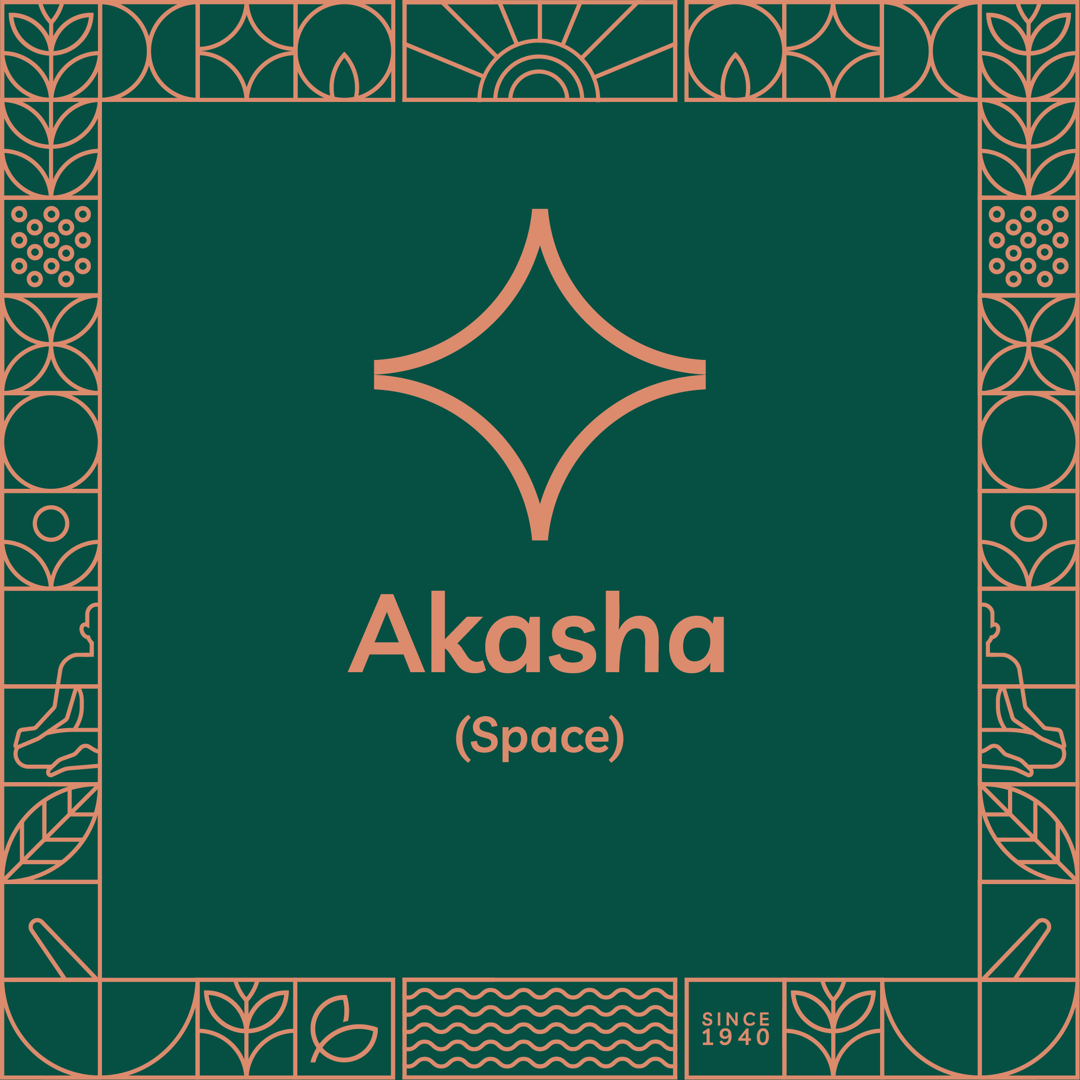
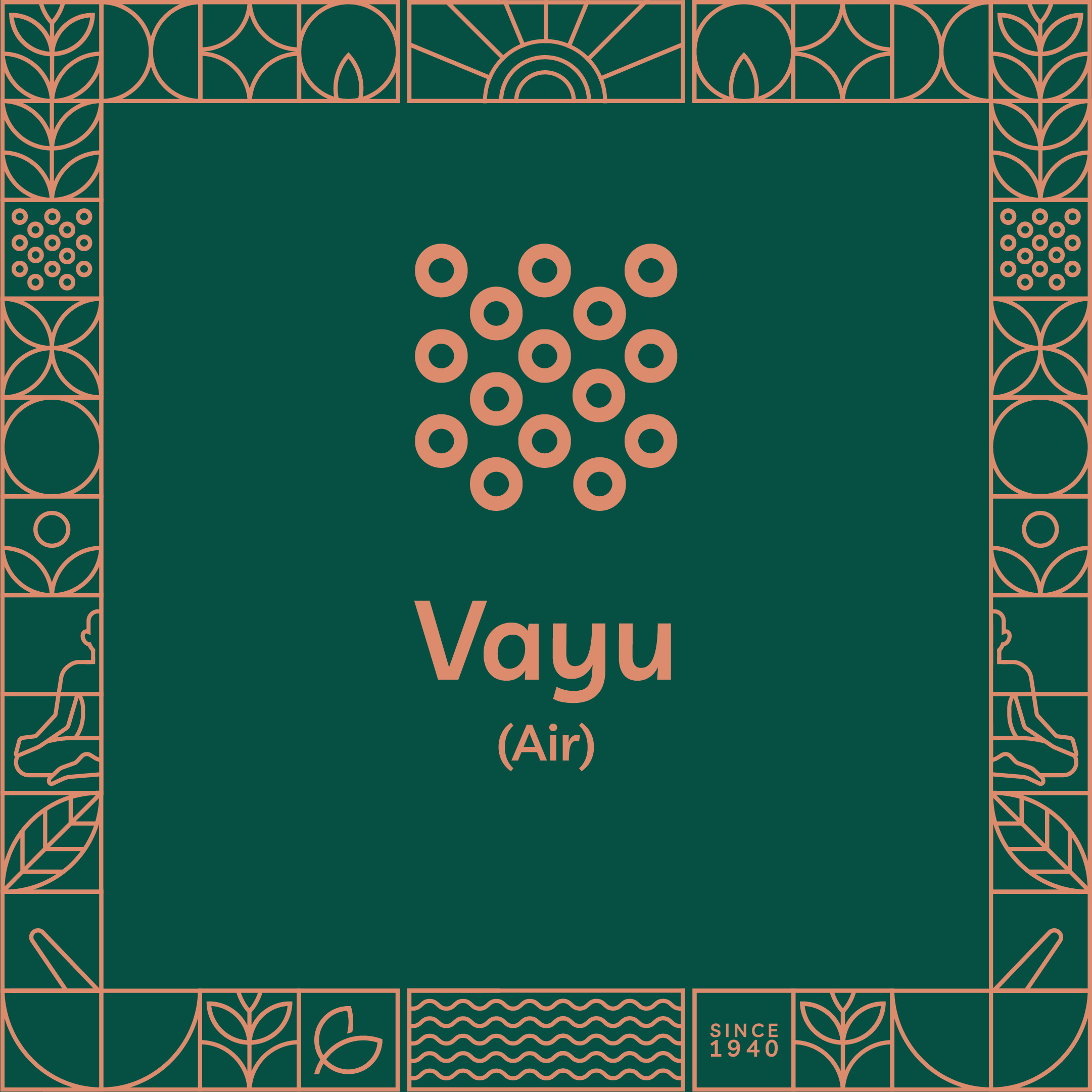
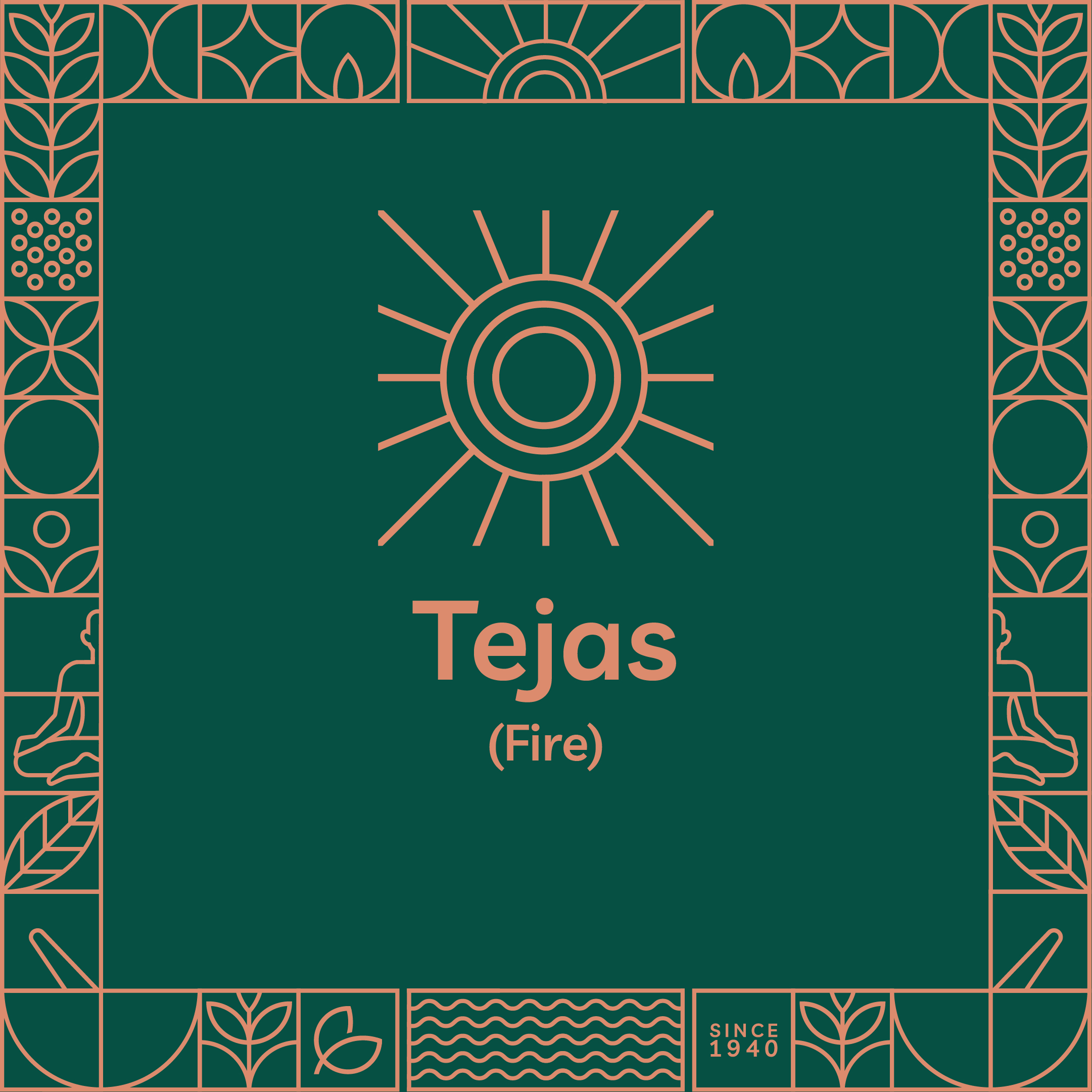
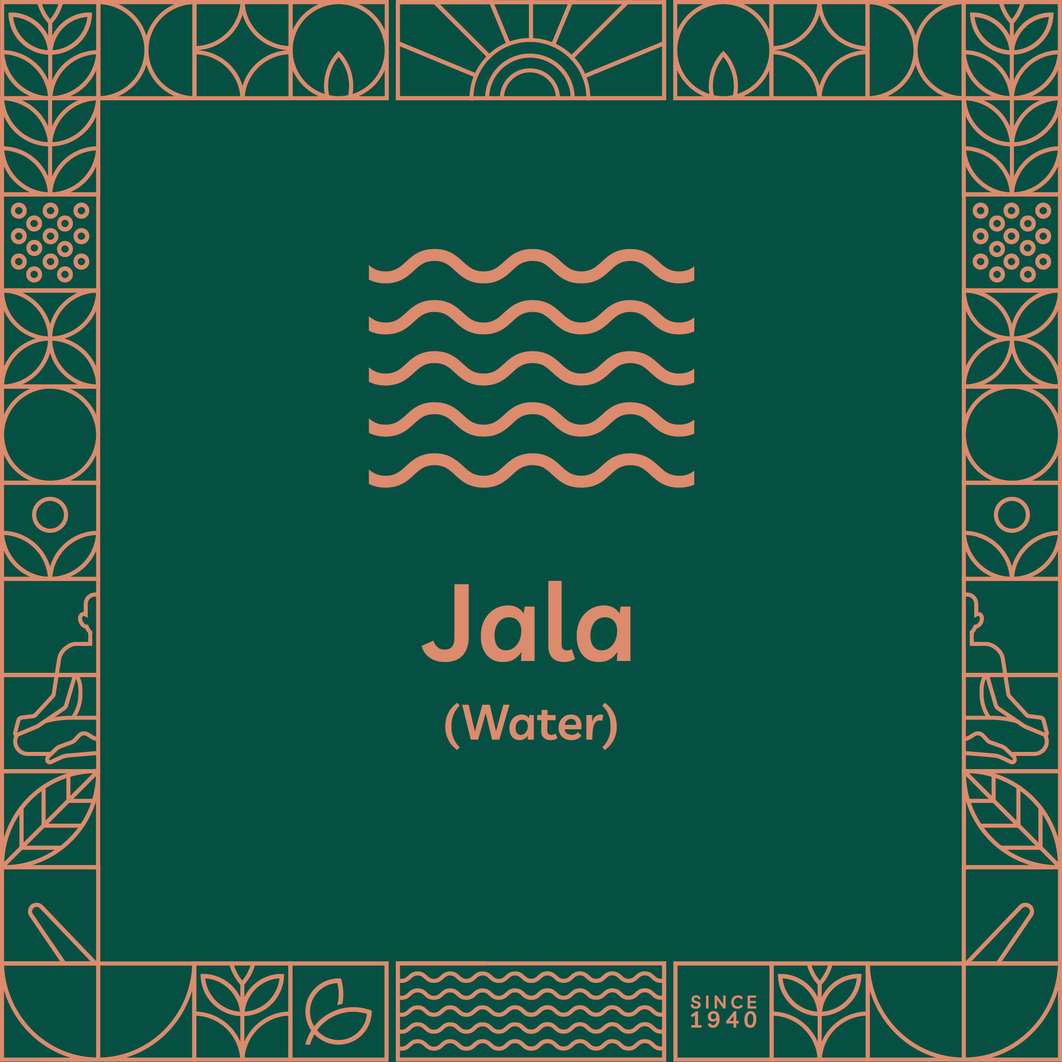
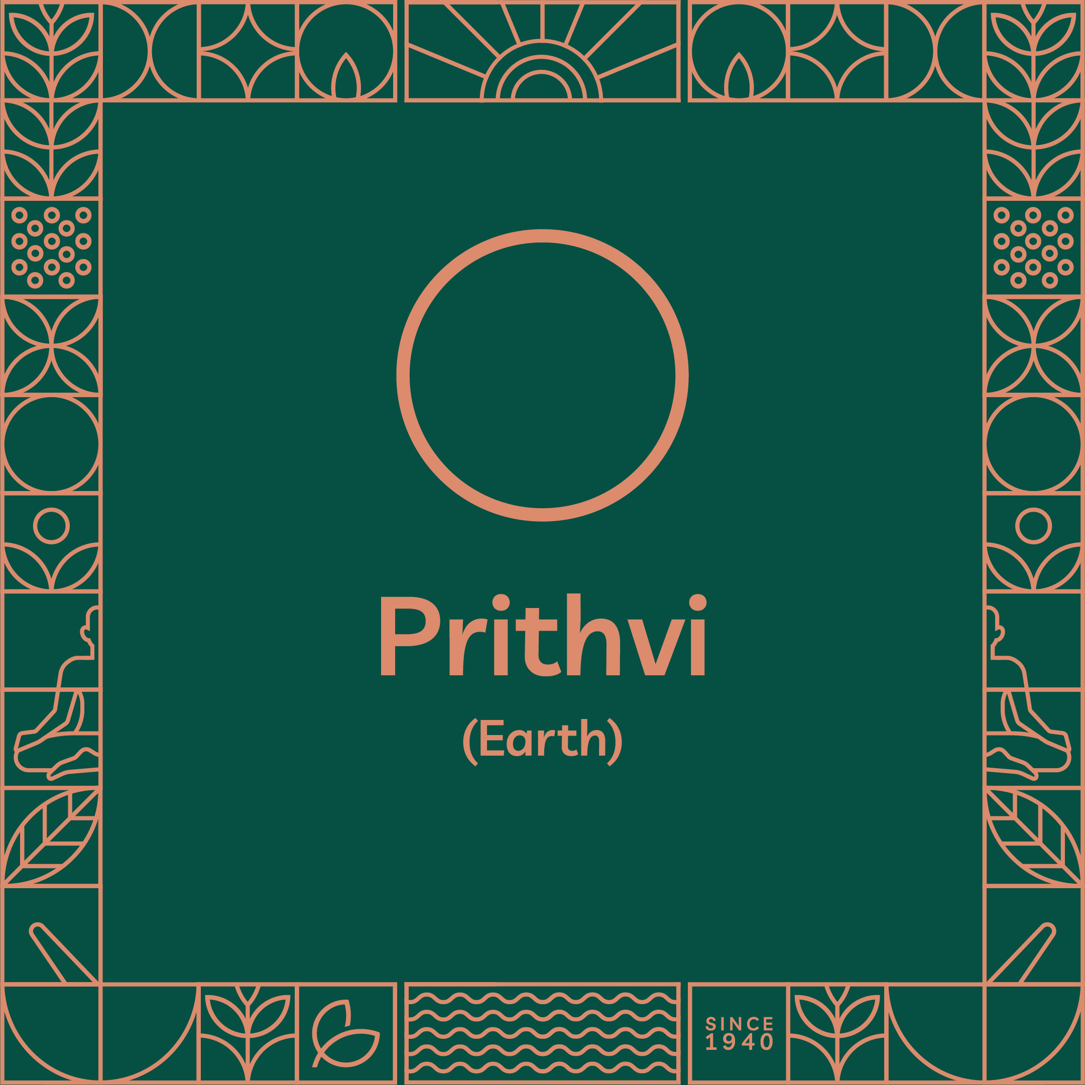

The previous Chempankulam Ayurveda logo internally known as “Sourced from Nature” represented by a graphic element of the layered leaf. The brand new logo is the holistic idea of “Pranasanthulan” means balancing life in Sanskrit. We draw inspiration from the five elements described in Ayurveda (Space, air, fire, water and earth) to create traditional values of the brand.
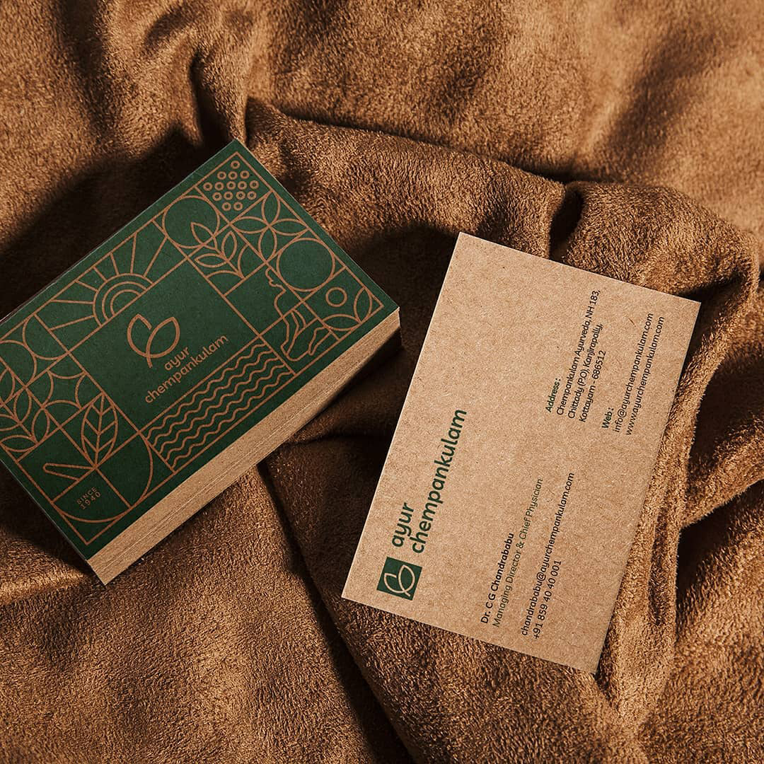
The earthy brown and dark green packaging nods to the natural tone and conveys the line’s focus on tradition and selection of all-natural resources, but with a premium look. The brand identity and packaging for Ayur Chempankulam are fresh, simple and modern, presenting the product as routed to earth, premium and authentic. The identity uses the colors of brown and green to suggest earth and nature stand out from the stores’ shelves among other competitor brands.