Canadian Origins
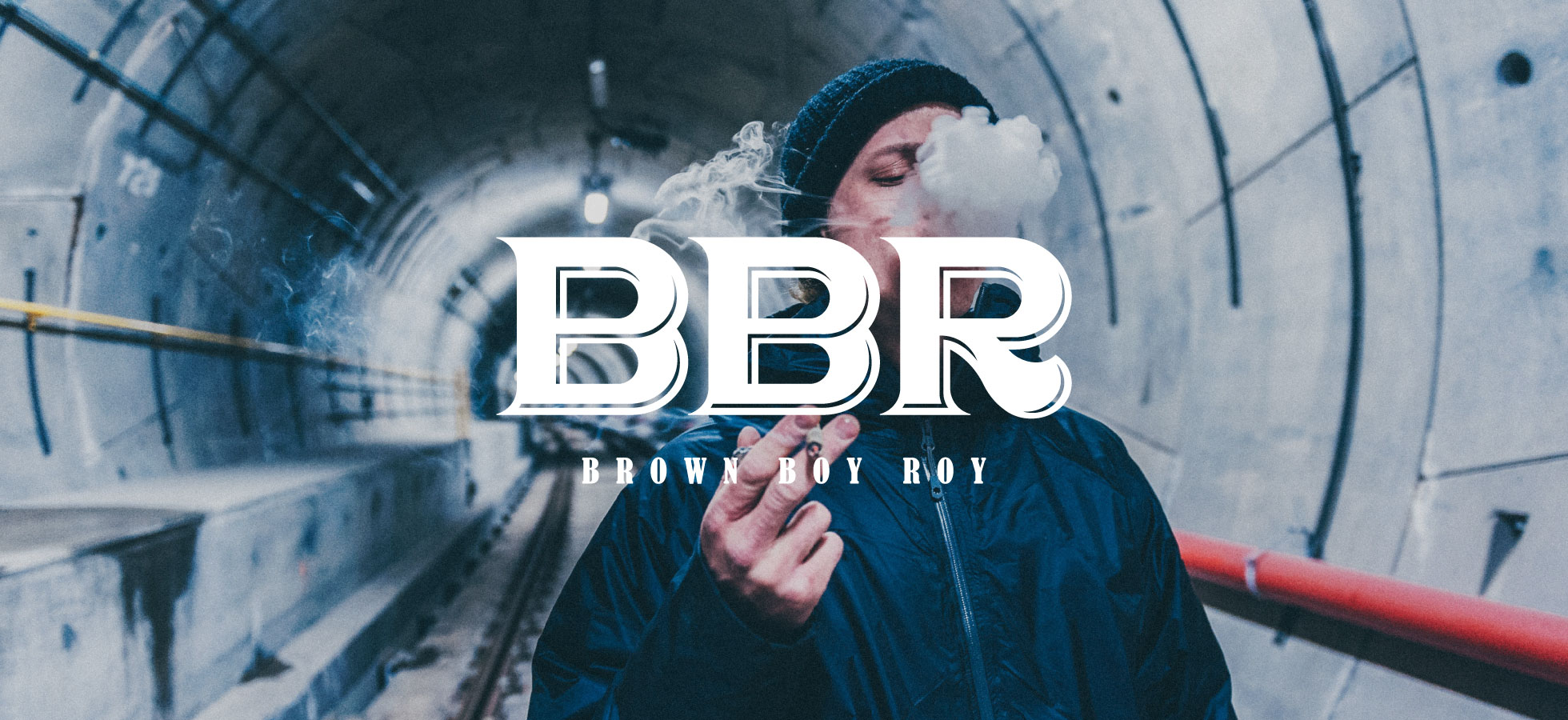
Brown Boy Roy
Year
2021
Client
Brown Boy Roy
Type of client
Retail
Type of Work
Brand Identity, Packaging
Created a premium design line of rolling paper for an Indian brand with Canadian Origins.
The name “Brown Boy Roy” was abbreviated to BBR, a play on positioning the brand in the premium rolling paper category. The logo typography is set in the versatile serif monotype. Founder Roy and his team wanted to establish a brand that avoided similarity for a more playful image that would still represent love and a great time. The identity centres on a classic lettering format neatly constructed of bold BBR, accompanied by a creative packaging that is layered with a unique artwork on social hangout culture.

The illustration is a key component of BBR’s visual personality. As the rolling paper styles evolved over the years, its perception grew organically, resulting in different ways of depicting things like social gatherings, cult following and experience but when options clustered and seem visually boring and unimaginative, and not unique for the online roll surfers.

Pixpil designers drew a new set of illustrations and established a style guide for their product packages going forward without losing their vibrancy.

The details were engaging, playful details help make the BBR packaging feel premium and special—and also to enhance a positive feeling to keep user’s happy, exciting experience of the product inside.


