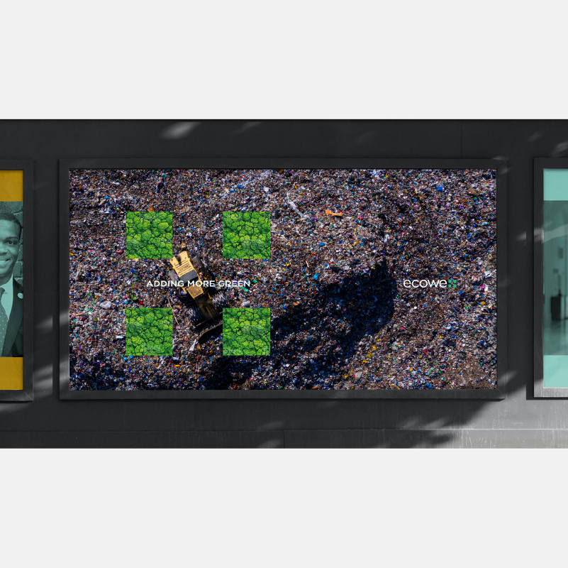
Adding More Greener Spaces
ECOWE PLUS
Year
2021
Client
Ecowe Plus
Sector
Manufacturing & Industrials
Type of Work
Brand Identity, Communication
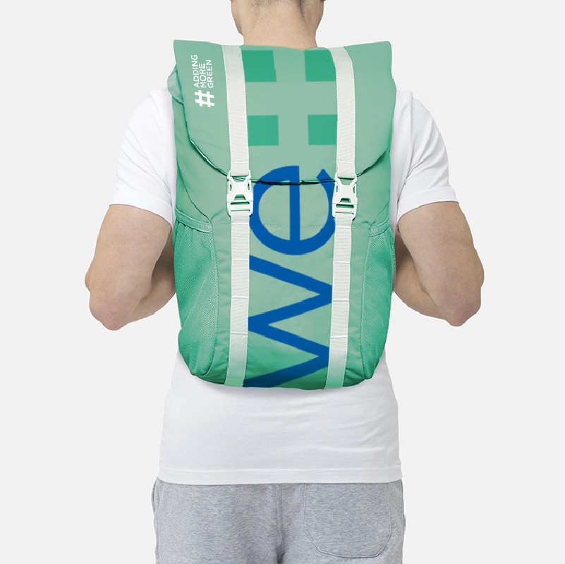
Defined a simplified visual identity for an organization with the mission to protect, restore, and manage plastic waste disposal within an urban infrastructure system.
A waste management and plastic re-cycling startup. Service that uses editorial arguments, community building and waste management awareness to tackle plastic pollution. Pixpil design and strategy team worked closely with the company to develop a strong brand identity and tone of voice.
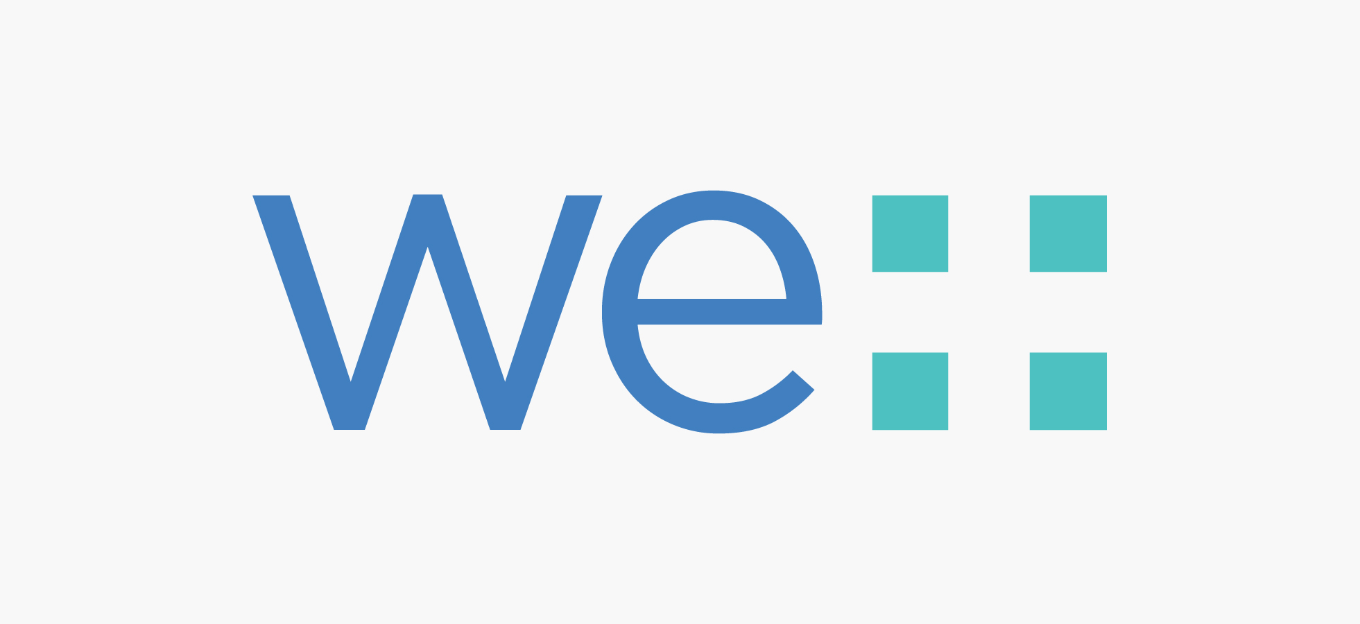
Designed into the geometry of the wordmark is a plus mark,
an apt symbol for what ecowe+ does. Adding more green to the environment. The ecowe+ wordmark is bold, simple and friendly.
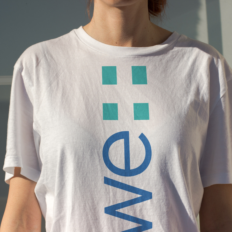
The plus mark instantly conveys how ecowe+ helps with: community building, raising concerns, awareness events, and adding more green areas with their work. The symbol can be used to visually represent growth and community networking.
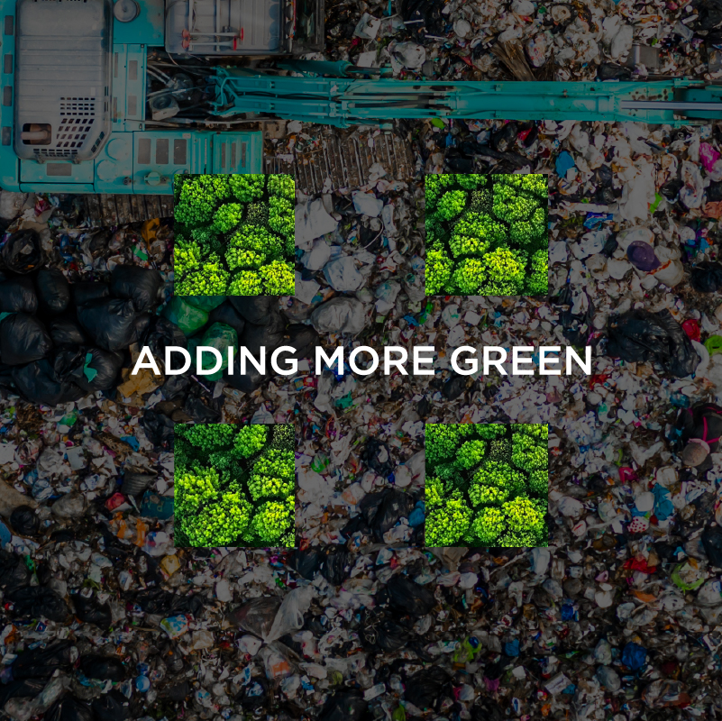
We chose a teal infused green to enhance the freshness and combined well with a bright blue to signify the mission towards sustainability. Ecoveplus is adding more green spaces everyday with their inspiring vision, a yard at a time.